Creating a custom Toggle in SwiftUI
SwiftUI is Apple’s new powerful framework to build applications across all Apple platforms. It is fast, simple, and easy to learn.
It has automatic support for Dark Mode, Dynamic Type, localization, and accessibility.
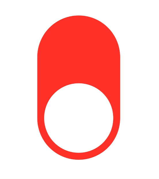
What we are going to make
We will make this Toggle which when tapped or dragged, changes its state and background color.
Getting started
Open up Xcode 11 and create a New Xcode Project.
Choose Single View Application under iOS.
Enter whatever you like in the Product Name, and make sure to choose SwiftUI in user interface.
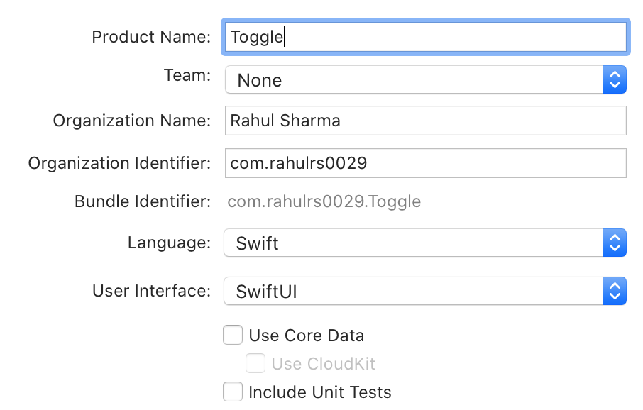
Click Next. Save it on anywhere you like and click Create.
Creating a static Toggle
Open ContentView.swift. This is the initial view of the app. Make sure the Canvas is visible on the right-hand side.
Our Toggle needs a background with a color, and a circle.
First, we will add a VStack. Inside this VStack, add a Spacer(), a Circle() and then a Spacer() again.
Circle() will be of size 160x160, and will have a fill color of White.
VStack will be of size 160x330, with cornerRadius of 90.0, padding of 16.0, and background color of red (initially).
You must add padding line before background color.
Your code will look like this:
struct ContentView: View {
    var body: some View {
        VStack {
            Spacer()
            Circle()
                .fill(Color.white)
                .frame(width: 160, height: 160)
            Spacer()
        }
        .frame(width: 160, height: 330)
        .padding(16.0)
        .background(Color.red)
        .cornerRadius(90.0)
    }
}
Build and run. The knob will currently be at the middle of Toggle. It will be fixed later on.
Moving toggle knob with tap
In ContentView struct, add a @State variable called isOn and initally set it to false.
When the value of State variable changes, the view invalidates its appearance and recomputes the body.
Read more about
Stateon Apple Developer Documentation
If isOn is set to true, the knob will be at the top of Toggle i.e. it will be on. And vice-versa.
So, we will change the code inside VStack to:
if !isOn {
    Spacer()
}
Circle()
    .fill(Color.white)
    .frame(width: 160, height: 160)
if isOn {
    Spacer()
}
This will move the circle knob according to isOn variable value.
Now, add a tap gesture on Circle using onTapGesture.
.onTapGesture {
    self.isOn.toggle()
}
Final code in VStack will look like:
if !isOn {
    Spacer()
}
Circle()
    .fill(Color.white)
    .frame(width: 160, height: 160)
    .onTapGesture {
        self.isOn.toggle()
    }
if isOn {
   Spacer()
}
Build and run, tap on the knob and it moves moves up and down accordingly.
Now, let's change the background color to green when toggle isOn.
Replace .background(Color.red) with .background(isOn ? Color.green : Color.red)
Build and run, the Toggle is now green when on, and red when off.
Toggle with gesture
Now we will add DragGesture() to the Circle() using .gesture().
DragGesture() as .onEnded which gets fired when drag ends.
.onEnded closure has DragGesture.Value which has a translation property. We will use it to determine if user dragged up or down, because toggle will turn on when dragged up and turn off when dragged down.
Add these line of code at the end of Cirlce().
.gesture(
    DragGesture()
        .onEnded { value in
            if value.translation.width < 0 {
                self.isOn = true
            } else {
                self.isOn = false
            }
        }
)
When value.translation.width is negative, user dragged up. And vice-versa.
Build and run, the knob now moves with when user drags.
Adding animation
Adding animation is super super easy.
Add this property to the VStack
.animation(.easeInOut)
Final code looks like:
struct ContentView: View {

    @State var isOn: Bool = false

    var body: some View {
        VStack {
            if !isOn {
                Spacer()
            }
            Circle()
                .fill(Color.white)
                .frame(width: 160, height: 160)
                .animation(.spring())
                .gesture(
                    DragGesture()
                        .onEnded { value in
                            if value.translation.width < 0 {
                                self.isOn = true
                            } else {
                                self.isOn = false
                            }
                        }
                )
                .onTapGesture {
                    self.isOn.toggle()
            	}
            if isOn {
                Spacer()
            }
        }
        .frame(width: 160, height: 330)
        .padding(16.0)
        .background(isOn ? Color.green : Color.red)
        .animation(.easeInOut)
        .cornerRadius(90.0)
    }

}
The knob now moves with ease in-out animation.
Finished source is available on my GitHub repository.
If you have any questions, feel free to contact me on Twitter (@rahulrs0029)