Creating a Progress Bar in SwiftUI
SwiftUI is Apple’s new powerful framework to build applications across all Apple platforms. It is fast, simple, and easy to learn.
It has automatic support for Dark Mode, Dynamic Type, localization, and accessibility.
What we are going to make
We will build this ProgressBar whose progress can be changed by using the Button. It will also have a beautiful animation.

Getting Started
Open up Xcode 11 and create a New Xcode Project.
Choose Single View Application under iOS.
Enter whatever you like in the Product Name, and make sure to choose SwiftUI in user interface.
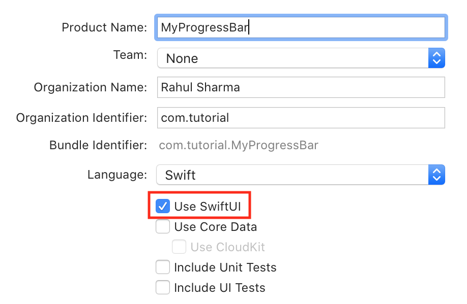
Click Next. Save it anywhere and click create.
Creating a static Progress Bar
SwiftUI apps don’t have Main.storyboard file. All UI you will make will be done programmatically.
Open up ContentView.swift file. This is the initial view of the app. Make sure the Canvas is shown on the right side.
Now, create a new SwiftUI file and name it ProgressBar. Replace Text() with a ZStack.
SwiftUI has 3 types of stacks.
VStack(which stacks the views vertically),HStack(which stacks the views horizontally), andZStack(which stacks the views on top of each other).
If you add 2 circles, one with radius 200, and other with radius 100, in a
ZStack, they will look like 2 concentric circles as they’re added on top of each other rather then added next to each other.
Inside this ZStack, add 2 Rectangle(). One for the progress, and one for the track.
Give the track rectangle the color of gray and opacity of 30%, and the progress rectangle a blue color.
Also, give both the rectangles a fixed frame for now and a corner radius of 4.0 to the ZStack.
ZStack {
    Rectangle()
        .foregroundColor(Color.gray)
        .opacity(0.3)
        .frame(width: 345.0, height: 8.0)
    Rectangle()
        .foregroundColor(Color.blue)
        .frame(width: 200.0, height: 8.0)
}
.cornerRadius(4.0)
ProgressBar would look weird right now. This is because the alignment of ZStack is set to center by default.
Change alignment of ZStack to leading as:
ZStack(alignment: .leading)
Now it should look more like a progress bar.
Changing progress of Progress Bar
Open ProgressBar.swift and add a @Binding property called progress of type CGFloat.
Binding is used to create a two-way connection between a view and its underlying model. Read more on Apple Developer Documentation
@Binding var progress: CGFloat
And change the frame of second rectangle according to progress like:
Rectangle()
	.frame(width: 345.0 * (progress / 100.0), height: 8.0)
Try building and compiler will give you an error
Missing arguement for parameter 'progress' in call.
Insert 'progress: <#Binding<CGFLoat>#>'
This is because we haven’t provided progress value for the Live Preview.
Change it to:
ProgressBar(progress: .constant(25.0))
You can create a constant Binding values using .constant(value) Try changing the value of progress to something else. ProgressBar will fill accordingly.
Now go back to ContentView.swift. Create a @State variable called progress of type CGFloat.
When the value of State variable changes, the view invalidates its appearance and recomputes the body. Read more on Apple Developer Documentation
@State var progress: CGFloat = 0.0
Next, add a VStack in the body of ContentView. This VStack will contain the ProgressBar we just created, and a button which will randomly set the progress when tapped.
VStack {
    ProgressBar(progress: $progress)
    Button(
        action: {
            self.progress = CGFloat.random(in: 0...100)
        }
    ) {
        Text("Random Progress")
    }
}
Now run the app and it should give you a random progress when button is tapped.
Adding animation when progress is changed
In ProgressBar.swift file, add a @State variable called isShown of type Bool, and set to false initially.
Add .onAppear { } at the end of ZStack. This will be called as soon as the ZStack is appeared. In .onAppear { } set the value of isShown to true.
struct ProgressBar: View {

    @Binding var progress: CGFloat
    @State var isShowing = false

    var body: some View {
        ZStack(alignment: .leading) {
            Rectangle()
                .foregroundColor(Color.gray)
                .opacity(0.3)
                .frame(width: 345.0, height: 8.0)
            Rectangle()
                .foregroundColor(Color.blue)
                .frame(width: 345.0 * (self.progress / 100.0), height: 8.0)
        }
        .onAppear {
            self.isShowing = true
        }
        .cornerRadius(4.0)
    }

}
Next, change the frame of progress bar to be like:
.frame(width: self.isShown ? 345.0 * (progress / 100.0) : 0, height: 8.0)
It will give the blue progress bar rectangle a width of 0 initially, but as soon as the ZStack appears, it will change its width to the progress provided.
Now adding animation is super easy.
Add this code below the frame line of blue rectangle.
.animation(.linear(duration: 0.6))
This adds a linear animation of duration 0.6 seconds to the rectangle. You can also choose ease-in or ease-out instead of linear.
Try playing with the animation duration and animation type.
Your code should now look like this:
import SwiftUI

struct ProgressBar: View {

    @State var isShowing = false
    @Binding var progress: CGFloat

    var body: some View {
        ZStack(alignment: .leading) {
            Rectangle()
                .foregroundColor(Color.gray)
                .opacity(0.3)
                .frame(width: 345.0, height: 8.0)
            Rectangle()
                .foregroundColor(Color.blue)
                .frame(width: self.isShowing ? 345.0 * (self.progress / 100.0) : 0.0, height: 8.0)
                .animation(.linear(duration: 0.6))
        }
        .onAppear {
            self.isShowing = true
        }
        .cornerRadius(4.0)
    }
}

struct ProgressBar_Previews: PreviewProvider {
    static var previews: some View {
        ProgressBar(progress: .constant(25.0))
    }
}
Finally, run the app in Live Preview of ContentView.swift, and press the button. Now the progress should animate beautifully to random value when the button is tapped.
Adding GeometryReader
Here’s a little challenge for you 😉
Try changing the progress bar frame to be dynamic rather than fixed. So that when you use change the frame of ProgressView() in ContentView.swift, its size should change according to set value rather than always being of size 345 (width) by 8 (height).
Hints:
1. You’ll need to use GeometryReader.
2. You can get width using geometry.size.width
Finished source is available on my GitHub repository.